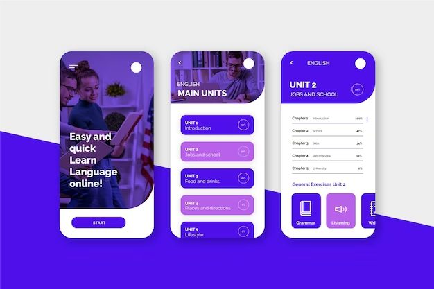
UI/UX designers usually are not clear about the delicate interplay between user interface and user experience that defines the essence of mobile app design. Knowing the key strategies that can be harnessed to navigate the challenge of user confusion while ensuring smooth navigation is also very important.
When it comes to mobile application development, the fusion of aesthetics and functionality is an artful dance, with users increasingly expecting visually captivating interfaces coupled with intuitive usability. This article will discuss the fundamental principles that underpin effective mobile app design, shedding light on how these principles can be easily incorporated into your design workflow.
What is a mobile app design?
Mobile app design refers to creating an android or iOS application’s visual and interactive elements. It involves the overall look and feel of the app, including the layout, color scheme, typography, and imagery. Mobile app design aims to provide users with a engaging, responsive, and enjoyable experience while using the app, ultimately enhancing user satisfaction and engagement.
UI/UX design principles every mobile app designer must know
UI (User Interface) design is an essential component of mobile app design. It focuses on the user interface’s visual elements and aesthetics, making sure the app is aesthetically pleasing and easy to navigate.
UX (User Experience) design is another important part of mobile app design. It includes a user’s overall experience while interacting with the app, considering factors such as usability, accessibility, and user satisfaction.
Here are the major UI/UX design principles that you must consider when designing a smartphone app:
Make things easier for users
Your primary focus should be user satisfaction; give them what they want right away from your app and make your app helpful for them. When people get a new app, they usually want to use it for a specific job. Make an excellent first impression when they open your app. Don’t bother them immediately.
Let users do what they want to do quickly. People use apps to find information, do something, or enjoy content. If they can’t do what they want quickly, they might leave your app and never return.
Break big tasks into easy steps. Cognitive load is how much effort your brain uses to finish a task. Make it easy for users to go step by step in your app. It shouldn’t feel like a challenging job.
For example, in a checkout process, instead of asking for all information at once, ask for it in smaller steps:
- The address
- Billing info
- Credit card details
Make navigation app predictable
Create a user-friendly navigation system and align it with familiar design patterns. Consider user expectations, adapt trends thoughtfully, and comply with industry standards. It will be beneficial to follow the 3-click rule for trouble-free access, display clear page names, and handle errors gracefully.
Key points:
- User expectations: To guide navigation design, use previous app experience.
- Trend adaptation: Take help or ideas from UX trends and modify them for your app.
- Standards compliance: Follow platform guidelines and design principles
- 3-click rule: Adhere to this rule and make it easier for users to reach any part of your app within three clicks.
- Clear page identification: Display names for instant user understanding.
- Error handling: Provide options to return or suggest alternatives for error recovery.
- Save user progress: Implement progress-saving for seamless task resumption.
- Task analysis: Understand user behaviors to refine the user experience.
- Cross-device accessibility: Ensure a consistent experience across multiple devices.
Follow standard UI conventions
When designing your application’s navigation and interface, leveraging familiar conventions that align with users’ existing mental models is vital. Rather than creating entirely novel UI elements, utilize common frameworks users encounter daily across platforms.
For example, an “X” icon in the top corner is a universally recognized symbol for closing a window. Follow this standard functionality instead of using the “X” for another purpose, as that would violate established expectations.
Similarly, include “Save” buttons on input forms so users can easily preserve the information they have entered—this is a common practice. Use light background colors for text fields to indicate they are editable, remaining consistent with norms.
Prioritize design (Craft a clear and organized page layout)
Organize pages and menus based on importance, with primary tasks and options in the main navigation and secondary items in a sub-menu. Prioritize items using visual weight adjustments like font size, color contrasts, and spatial placement. Recognized users tend to scan pages and content in F and Z patterns, with attention going to large headers and images at the top and left sides. Place vital text and visuals in those areas to increase noticeability.
Following recognized conventions and accounting for common viewing behaviors enhances findability and usability while reducing the learning curve. Relying on familiar symbols, interfaces, and hierarchies makes your application more intuitive by leveraging existing user habits. It promotes more straightforward navigation and information discovery without overly taxing the user.
Keep your app’s look and feel consistent with your brand
Ensure all your app’s buttons, input fields, and other parts match your brand’s style. This way, users can easily recognize and understand your app.
Ensure consistent navigation
If your app is related to a website, make sure the way users move around is similar. Avoid changing colors or essential functions to prevent confusion. Users should be able to predict how your app will work and look most of the time.
Design elements with mobile users in mind
Remember that mobile users can’t hover or use a cursor. Design elements to help users understand their purpose without relying on these features.
Make it easy for users and don’t overwhelm them with requests
Here is how you can make it easy for your users to use the app:
Avoid asking for too much information upfront
Users see your app as a solution to their problems. Don’t bother them with questions, registrations, or sign-up forms immediately. Let them freely use your app until it’s necessary to log in or provide information.
Minimize typing requirements
Typing on smartphones can take time and effort. Try to get information without asking for text input. If needed, use input masks as a guide.
Prefill data whenever possible
Instead of asking users to type their location, let them share it, and use GPS data to fill in their address. Provide optional inputs and don’t ask for unnecessary information.
Enable autofill features
Take advantage of the phone’s features to automatically fill in fields. For example, some apps let users provide payment information by scanning their credit cards with the camera.
Make your app load quickly and inform users
Users prefer to avoid waiting for apps to load, so ensuring your app loads swiftly is crucial to minimize user frustration. Additionally, it’s essential to communicate the loading process to users effectively. If your app is in the process of loading, provide clear indications, such as progress bars or spinners, so users understand that it’s not a malfunction.
Seeing a blank loading screen might make users believe the app is broken. To counter this, gradually load parts of the content to display something usable as soon as possible. Incorporate visually appealing loading animations to entertain users during the loading period.
Optimize your app for mobile and diverse users
When designing your app, consider the diversity of devices and users. If your app includes a significant amount of text, make sure it scales nicely on screens of all sizes. Aim for text lines containing no more than 40 characters to enhance readability and adjust line spacing accordingly. Ensure your app can be viewed in both portrait and landscape modes for visual content like images and videos.
When creating the layout, design buttons that are easily clickable and well-spaced to prevent accidental taps; it’s essential that your app works seamlessly across various devices, from small smartphones to large tablets. Pay attention to how your pages appear on different screen sizes to avoid cluttered displays on smaller screens.
Design your app with people in mind
Consider the diverse needs of your users when designing your app:
Font size
Use a minimum font size of 16px to accommodate users with impaired vision and ensure legibility for everyone.
Color blindness
Avoid relying solely on colors for communication. Incorporate symbols along with colors to make your app accessible to users with color blindness.
Deafness
Make your app accessible to the deaf and hard of hearing by providing captions and subtitles for video and audio content.
Disabilities
Utilize HTML features like alt attributes to describe visual content, making your app accessible to those who cannot see. Adhere to established accessibility standards in UX.
Gender selections
Unless necessary for your app’s core functionality, refrain from asking users to specify their gender. Prioritize inclusivity in visual and content design to create a more welcoming user experience for everyone.
Mobile app design best practices for UI/UX designers to follow
These are the best practices for UX and UI that you should follow when designing a mobile application:

Create intuitive user experiences
- Simplify tasks into clear steps
- Set defaults to minimize effort
- Allow interruptions and save progress
- Focus on critical goals without excess details or disruptions
Make interfaces invisible
- Highlight content over the interface
- Use cards, white space, and straightforward language to spotlight key info
- Limit features to essentials
Eliminate clutter
- Remove unnecessary elements
- Limit one primary action per screen
- Avoid forced registration; gather data gradually.
- Break up long forms; incorporate autocomplete
- Onboarding lowers abandonment and boosts retention
Make navigation obvious yet discoverable
- Inspire engagement
- Support app structure without drawing attention
- Make navigation accessible yet compact
- Prioritize common tasks
- Indicate location
- Use recognizable icons and patterns
- Hidden navigation hurts to use
- Tabs show major options upfront
- Make search prominent if critical
Design for one-handed use
- With larger screens, ensure the interface targets the thumb zone.
- Place destructive actions out of easy reach.
Speed matters
- Quickly load content.
- Use loading indicators and skeleton content to show progress.
- Keep users’ interest as they wait with distractions and background processing.
Send thoughtful and timely notifications
- Avoid excess messages that prompt uninstalls.
- Prioritize value over interruption.
- Personalize to inspire.
- Send at convenient times for the user’s time zone.
- Ask for permissions in context when applicable.
- Use data storytelling.
No web experiences
- Maintain visual consistency in UI.
- Use buttons over links.
- Keep users in-app.
- Guide at errors and empty states.
- Design for quick scanning.
Incorporate security and trust
- Don’t push ratings too early.
- Be transparent with permissions and data sharing.
- Display credibility badges.
Personalize experience
- Leverage user data to tailor content and remove noise.
- Include names.
- Analytics lets users self-serve insights.
Echo core interactions
- Reinforce main interactions with familiar, unified elements.
- Learning once enables reuse.
Simplify password entry
- Imprecise fingers and scrolling make complex passwords challenging on mobile.
- Keep users logged in to avoid reentering credentials.
Final verdict
Knowing the fundamentals of UI/UX mobile app design is compulsory for any designer. Foundational comprehension of UX & UI principles is mandatory for mobile products aspiring to distinction. Applying wise guidelines guarantees visually pleasing and interactionally instinctive interfaces that align with user priorities.
Due to continued innovation within tech, continual education around emergent design remains essential, as adaptation distinguishes leading apps. Impactful and user-receptive applications take form by cementing strong UX/UI foundations and then iteratively upgrading via the latest insights.
Ropstam’s skilled UI/UX design services can help you enhance your online presence by creating engaging and smooth user experiences that drive unmatched engagement and satisfaction. Contact us today to get a sleek and catchy design for your mobile or web app as per the project requirements.


